- Subscribe to RSS Feed
- Mark Thread as New
- Mark Thread as Read
- Float this Thread for Current User
- Bookmark
- Subscribe
- Printer Friendly Page
1. My product is books which are obviously rectangular. I've changed the aspect ratio from 1:1 to 2:3 but the images remain square on the page with all products so only a fraction of the book cover is shown. Is this normal?
2. On the individual product page they are rectangular but despite using the recommended size for the images they are cut off top and bottom.
- Mark as New
- Bookmark
- Subscribe
- Subscribe to RSS Feed
- Permalink
- Report
Hi @Shirlvoxpop!
Welcome to the community, it's great to see you found a thread with so much useful advice on this.
For tips on troubleshooting the different types of images that can be displayed on your site, take a look at the general guidelines below.
Non-background images:
- The best approach for non-background images added to any page of your site is to use JPEGs that are no more than 1,000 pixels on their longest side.
- For high quality images, we recommend using a photo hosting site made for photographers (e.g. Flickr.com) and embedding the images onto your site from there. We don’t design around larger, uncompressed, high-quality images because we need to host millions of images from millions of users. As a result, third-party image hosting can be a better way to make sure your image quality doesn’t go down.
Background images:
- For images that are a part of your site design (e.g. header, banner, and background images), it’s best to use an image that’s at least 2,000x1,000 pixels. This makes the image large enough to look good at full width on virtually any screen size.
Item images:
- A good rule of thumb is to use an image with a 1:1 aspect ratio that’s at least 2,000x2,000 pixels large. Anything lower than 2,000x2,000 could result in blurry images.
- If you’re taking product images on your own, check out our Square Photo Studio app, where you can take professional-looking, quality product photos directly from your mobile device.
Category images:
- Category images should generally be at least 160 pixels on the shortest side and have a 4:3 aspect ratio.
I hope this, and the links previously shared help! But if not, perhaps you could provide a little more detail on what you're hoping to achieve, and maybe share some screenshots and a link to your site?
- Mark as New
- Bookmark
- Subscribe
- Subscribe to RSS Feed
- Permalink
- Report
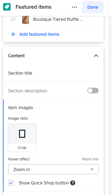
Hi, unfortunately images need to be corrected within the editor in a couple of places. On the Home Page, Shop All page, Featured Items Page and on Item Details Page. I added a screenshot of what you are looking for.
Item Ratio (gives options), Hover Effect (gives options), Show Quick Shop is for home page.
You may need to square 1:1 your images for better presentation or zoom effect.
Hope this helps!
Terri
🛍 Shop my stores
Personalized Gifts - name-gift-box.square.site
Home Decor - enhance-home.square.site
Resale Collection - hanger-hues.square.site
TERRI
I have a few images that are too tall for the item photo. I have tried cropping them down, resizing, nothing works. Please help
HI, hopefully these Square Support pages will help.
https://squareup.com/help/us/en/article/6894-product-images-on-square-online-store
https://squareup.com/help/us/en/article/6887-adding-pictures-to-your-square-online-store
TERRI
I'm having the same problem. It's frustrating 😤
- Mark as New
- Bookmark
- Subscribe
- Subscribe to RSS Feed
- Permalink
- Report
Hi @Shirlvoxpop!
Welcome to the community, it's great to see you found a thread with so much useful advice on this.
For tips on troubleshooting the different types of images that can be displayed on your site, take a look at the general guidelines below.
Non-background images:
- The best approach for non-background images added to any page of your site is to use JPEGs that are no more than 1,000 pixels on their longest side.
- For high quality images, we recommend using a photo hosting site made for photographers (e.g. Flickr.com) and embedding the images onto your site from there. We don’t design around larger, uncompressed, high-quality images because we need to host millions of images from millions of users. As a result, third-party image hosting can be a better way to make sure your image quality doesn’t go down.
Background images:
- For images that are a part of your site design (e.g. header, banner, and background images), it’s best to use an image that’s at least 2,000x1,000 pixels. This makes the image large enough to look good at full width on virtually any screen size.
Item images:
- A good rule of thumb is to use an image with a 1:1 aspect ratio that’s at least 2,000x2,000 pixels large. Anything lower than 2,000x2,000 could result in blurry images.
- If you’re taking product images on your own, check out our Square Photo Studio app, where you can take professional-looking, quality product photos directly from your mobile device.
Category images:
- Category images should generally be at least 160 pixels on the shortest side and have a 4:3 aspect ratio.
I hope this, and the links previously shared help! But if not, perhaps you could provide a little more detail on what you're hoping to achieve, and maybe share some screenshots and a link to your site?
- Mark as New
- Bookmark
- Subscribe
- Subscribe to RSS Feed
- Permalink
- Report

