- Subscribe to RSS Feed
- Mark Thread as New
- Mark Thread as Read
- Float this Thread for Current User
- Bookmark
- Subscribe
- Printer Friendly Page
Featured Square Online Site: The Benev
Hello! Every other week, I will be featuring rad sites built using Square Online by sellers like you. It’s a great way to pick up tips that you can incorporate into your own site!
This week we’re going to take a look at store.thebenev.com.au, the online store created by @thebenev.
The first thing I notice when I visit the site is the tasteful header background images. The best background images are those that are visually appealing but don’t have a specific focal point.
The image above has a nice subdued order to it but doesn’t focus on any single object. This is important because the image may be cropped and displayed differently on different screen sizes.
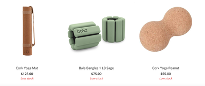
The second thing I notice is the super clean product photos. I’ve mentioned this before in featuring other sites how important product photos can be towards making a sale.
Not only does it make it easier for your customers to really see what it is they are buying, but it screams professionalism. It’s also super easy to do this now using the Square Photo Studio app, which automatically removes the background from photos you take with your phone. Super neat!
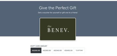
Lastly, under the GIFTING menu item is a link to a page where you can buy gift cards. Gift cards are likely something you’ll want to offer, especially during the holiday season.
This is really easy to add to a site with Square Online since it is automatically created for you. You just need to add a gift cards page to your site.
What do you think? Let me know in the comments below! Let me know if you have a site you want to nominate - just send me a private message (hover over my username, then click on the button in the popup to send a message)!
For more in this series, see:
Featured Square Online Site: Bradley’s Orchard
Featured Square Online Site: Miette Patisserie & Confiserie
Featured Square Online Site: Bentspoke Brewing, Co
Featured Square Online Site: Sheek Studio
Featured Square Online Site: Whisky Run Golf Club
Featured Square Online Site: Fatback’s BBQ
Seller Community, Platform
- Labels:
-
Featured Site
-
Square Online
- Subscribe to RSS Feed
- Mark Thread as New
- Mark Thread as Read
- Float this Thread for Current User
- Bookmark
- Subscribe
- Printer Friendly Page
I love the colors and theme of the website, it definitely makes you feel relaxed.
I also really appreciate the descriptions for the products. I know it takes a lot of time to work on them, but customers are more confident in making a purchase when you make all the information easily available to them.
- Subscribe to RSS Feed
- Mark Thread as New
- Mark Thread as Read
- Float this Thread for Current User
- Bookmark
- Subscribe
- Printer Friendly Page
Thanks for calling out product descriptions, @TCSlaguna! That's something on my radar as a how-to guide - they're definitely important!
Seller Community, Platform
- Mark as New
- Bookmark
- Subscribe
- Subscribe to RSS Feed
- Permalink
- Report
- Subscribe to RSS Feed
- Mark Thread as New
- Mark Thread as Read
- Float this Thread for Current User
- Bookmark
- Subscribe
- Printer Friendly Page
I loved the +expanding options on https://www.thebenev.com.au/terms - I'd love to know how to do that! The site is beautiful. Where can we find more great examples like this?
- Subscribe to RSS Feed
- Mark Thread as New
- Mark Thread as Read
- Float this Thread for Current User
- Bookmark
- Subscribe
- Printer Friendly Page
Their main website was actually built somewhere else, so I'm not sure what they used for the expandable terms. You could do this with Square Online using the embed code section, though. Including a third party widget like this one should work great. 😁
Seller Community, Platform
- Mark as New
- Bookmark
- Subscribe
- Subscribe to RSS Feed
- Permalink
- Report
- Subscribe to RSS Feed
- Mark Thread as New
- Mark Thread as Read
- Float this Thread for Current User
- Bookmark
- Subscribe
- Printer Friendly Page
If you are savvy at hacking through code, you can use this as a starting point.
https://www.webnots.com/css-faq-or-accordion-widget-for-weebly-site/
You'd simply add the .css code and the .html code in an embed code block and edit to fit your style.
- Mark as New
- Bookmark
- Subscribe
- Subscribe to RSS Feed
- Permalink
- Report


