- Subscribe to RSS Feed
- Mark Thread as New
- Mark Thread as Read
- Float this Thread for Current User
- Bookmark
- Subscribe
- Printer Friendly Page
Featured Square Online Site: SheekStudio.com
Hello! 👋 Every other week, I will be featuring rad sites built using Square Online by sellers like you. It’s a great way to pick up tips that you can incorporate into your own site!
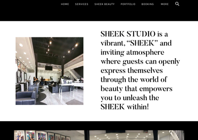
This week we’re taking a look at SheekStudio.com, the website for New Jersey-based Sheek Studio.
Some businesses make heavy use of black as a background for branding, which means that they will likely want to use that as a background on their website. Sheek Studio’s logo would require that at least their navigation background be black:
You can make further use of black as a background in other sections, though you’ll need to consider what your content looks like on top of it. The high contrast of black versus colors and text means that you need to be more minimalist with your content.
Sheek Studio achieves this by keeping both backgrounds and text colors monochromatic. Using a white background for one section breaks up the page for a visitor, so they absorb information in smaller chunks. It also prevents your eye from being overwhelmed by too many contrasting colors.
Another note about fonts: you’ll notice that there are only two fonts used. One font is used for the site navigation, and another font is used for all the site text. Using just two means that your brain doesn’t need to expend as much effort mapping the font to letters of the alphabet. Think of it like a computer, where it needs to use more memory and processing power to handle the extra fonts.
One final touch I wanted to call out is the inclusion of a statement and signature by salon owner Reyna Sheek.
Just like on printed brochures, including a signature and statement on your website adds a nice personal touch. It helps you connect directly with your customers in a human way - this is really important when the communication method isn’t direct like a phone conversation or in-person chat.
What do you think? Let me know in the comments below! Let me know if you have a site you want to nominate - just send me a private message (hover over my username, then click on the button in the popup to send a message)!
For more in this series, see:
Featured Square Online Site: Whisky Run Golf Club
Featured Square Online Site: Fatback’s BBQ
Seller Community, Platform
- Labels:
-
Featured Site
-
Square Online
- Subscribe to RSS Feed
- Mark Thread as New
- Mark Thread as Read
- Float this Thread for Current User
- Bookmark
- Subscribe
- Printer Friendly Page
Hi, @Spa1669. It looks like your site is built using a different builder than Square Online, right? It looks like it was built using Squarespace. I did a Google search and found some results which might help.
Seller Community, Platform
- Mark as New
- Bookmark
- Subscribe
- Subscribe to RSS Feed
- Permalink
- Report
- Subscribe to RSS Feed
- Mark Thread as New
- Mark Thread as Read
- Float this Thread for Current User
- Bookmark
- Subscribe
- Printer Friendly Page
Ah perfect!
- Subscribe to RSS Feed
- Mark Thread as New
- Mark Thread as Read
- Float this Thread for Current User
- Bookmark
- Subscribe
- Printer Friendly Page
I thought the two were connected? I'm sorry for the misunderstanding. Can you send those findings? Or what tags you used to Google?
- Mark as New
- Bookmark
- Subscribe
- Subscribe to RSS Feed
- Permalink
- Report
- Subscribe to RSS Feed
- Mark Thread as New
- Mark Thread as Read
- Float this Thread for Current User
- Bookmark
- Subscribe
- Printer Friendly Page
I would love to know how these categories are done!! I've tried on my site but can't get it done 😢
- Subscribe to RSS Feed
- Mark Thread as New
- Mark Thread as Read
- Float this Thread for Current User
- Bookmark
- Subscribe
- Printer Friendly Page
Hi Adam, thanks for sharing Sheek Studio website. I have been a customer of square for quite a while. Can you please tell me did square update by adding a gallery to your service page. I've been wanting to add this feature for some time, this would be great.
- Subscribe to RSS Feed
- Mark Thread as New
- Mark Thread as Read
- Float this Thread for Current User
- Bookmark
- Subscribe
- Printer Friendly Page
We do have an image gallery section that you can add to regular pages of your site. Is that what you are looking for, @Tuttyplace?
Seller Community, Platform
- Mark as New
- Bookmark
- Subscribe
- Subscribe to RSS Feed
- Permalink
- Report
- Subscribe to RSS Feed
- Mark Thread as New
- Mark Thread as Read
- Float this Thread for Current User
- Bookmark
- Subscribe
- Printer Friendly Page
This is very informative thank you.
- Mark as New
- Bookmark
- Subscribe
- Subscribe to RSS Feed
- Permalink
- Report
- « Previous
-
- 1
- 2
- Next »


