- Subscribe to RSS Feed
- Mark Thread as New
- Mark Thread as Read
- Float this Thread for Current User
- Bookmark
- Subscribe
- Printer Friendly Page
Featured Square Online Site: Salsa Saint
Hello! Every other week, I will be featuring rad sites built using Square Online by sellers like you. It’s a great way to pick up tips that you can incorporate into your own site!
This week we’re going to take a look at salsasaint.com, the online store for New Mexico-based Salsa Saint created by @salsasaint!
Branding is very important in web design. It unites your whole site together in one professional package. What does that look like in practice?
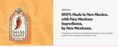
For Salsa Saint, this meant choosing button colors that pull directly from their logo. It also meant choosing fonts that match the spirit and tone of their logo and products.
Since we’re talking about text, it’s important to have the text on your homepage be both catchy and short. Salsa Saint packs a punch with bold, easy-to-read sentences:
Consider the time you have for visitors to read your text to be precious. If you only have a few seconds, what do you want to say to them to get their attention? Salsa Saint’s text tells you that you’re getting authenticity from people who consider what they are making sacred.
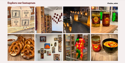
Finally, take a look at the Instagram section near the bottom of the homepage. Today, social media is a critical part of business and website promotion.
The Instagram section will not only add dynamic content to your homepage. It will also help drive traffic to your Instagram profile. More followers on Instagram means more opportunities to put your business and products in front of customers.
What do you think? Let me know in the comments below! Let me know if you have a site you want to nominate - just send me a private message (hover over my username, then click on the button in the popup to send a message)!
For more in this series, see:
Featured Square Online Site: The Benev
Featured Square Online Site: Bradley’s Orchard
Featured Square Online Site: Miette Patisserie & Confiserie
Featured Square Online Site: Bentspoke Brewing, Co
Featured Square Online Site: Sheek Studio
Featured Square Online Site: Whisky Run Golf Club
Featured Square Online Site: Fatback’s BBQ
Seller Community, Platform
- Labels:
-
Featured Site
-
Square Online
- Subscribe to RSS Feed
- Mark Thread as New
- Mark Thread as Read
- Float this Thread for Current User
- Bookmark
- Subscribe
- Printer Friendly Page
Wow! I am blown away by this website. The layout is amazing!
I really like how the text is on the left in the first section, followed by being on the right in the second section. I think it helps in the storytelling.
The most popular categories, followed by most popular items, highlight the variety of products while making it so easy to find something you like. The product images are exceptional.
Most of all, I love the reviews section. The black background really makes it stand out,
One recommendation: When you click Monthly Clubs, New Mexican Salsa of the Month Club does not show up. May want to add it.
- Subscribe to RSS Feed
- Mark Thread as New
- Mark Thread as Read
- Float this Thread for Current User
- Bookmark
- Subscribe
- Printer Friendly Page
I'd love to have our site ( kismetrefining.com ) reviewed like this. Great tips on what makes Salsa Saint a good website using the square builder. I come from a Wordpress background and have struggled to get my vision built using the tools provided. We've turned back to using Wordpress to build out a recipe/product use guide for our products since its much easier to create databases of content that can quickly be reconfigured and reshared after adding it once, wherein the story mode in square everything needs to be relinked re-typed multiple times over.
- Subscribe to RSS Feed
- Mark Thread as New
- Mark Thread as Read
- Float this Thread for Current User
- Bookmark
- Subscribe
- Printer Friendly Page
Glad you like the review! Depending on the needs of a seller, sometimes there's a different option more suited to your goals than Square Online. Were you trying to include content from a story in Square Online on different pages of the site?
Seller Community, Platform
- Mark as New
- Bookmark
- Subscribe
- Subscribe to RSS Feed
- Permalink
- Report
- Subscribe to RSS Feed
- Mark Thread as New
- Mark Thread as Read
- Float this Thread for Current User
- Bookmark
- Subscribe
- Printer Friendly Page
Yeah, I guess it's hard to describe what I'm looking for. Right now it feels like the Story functionality of Square Online is a bit limited but has definitely been moving in the right direction. The free reign of customization in Wordpress allows for a lot of freedoms, but ultimately right now the story features in Square Online seem limited or not intuitive for creating a database of post information that can be easily recalled and embedded in more than one location. It feels like with every story I'm creating a new single-page website from scratch instead of easy template bases.
Things like recipe cards would be a nice feature to the add-in. Story and product posting/'inking to services like Buffer would be nice for multi social publishing, integration with Canva for pulling in photo content, and other assets directly.
- Subscribe to RSS Feed
- Mark Thread as New
- Mark Thread as Read
- Float this Thread for Current User
- Bookmark
- Subscribe
- Printer Friendly Page
So awesome. So many smart little touches that really bring a huge sense of professionalism to it all.
Thanks for diving in @AdamB !
- Subscribe to RSS Feed
- Mark Thread as New
- Mark Thread as Read
- Float this Thread for Current User
- Bookmark
- Subscribe
- Printer Friendly Page
It's those little things that make all the difference, right?
Seller Community, Platform
- Mark as New
- Bookmark
- Subscribe
- Subscribe to RSS Feed
- Permalink
- Report
- Subscribe to RSS Feed
- Mark Thread as New
- Mark Thread as Read
- Float this Thread for Current User
- Bookmark
- Subscribe
- Printer Friendly Page
@salsasaint @AdamB Old thread and nice site, only things missing from this site are the back to top button and bold text/text color change or some other way of distinguishing what page you're on if your'e on a page from the navigation links.
- Mark as New
- Bookmark
- Subscribe
- Subscribe to RSS Feed
- Permalink
- Report


