- Subscribe to RSS Feed
- Mark Thread as New
- Mark Thread as Read
- Float this Thread for Current User
- Bookmark
- Subscribe
- Printer Friendly Page
Featured Square Online Site: Fatback’s BBQ
Hello Sellers! Every other week, I will be featuring rad sites built using Square Online by Sellers like you. It’s a great way to pick up tips that you can incorporate into your own site!
This week we’re going to look at the online ordering page for Fatback’s BBQ that Super Seller @Devin3627 created:
The first thing you’ll notice is how well the site matches the branding of Fatback’s BBQ. The background image, font, and colors are all the same as you’d see on packaging right at the restaurant. Consistent branding not only looks professional but creates a more seamless experience for your customers whether they buy online or in-person.
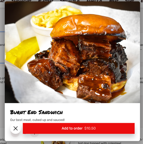
The next thing that stood out to me were the item images. If you like BBQ, you’re mouth will water when you see these:
Holy moly.
This is super important with food where customers will want to see what they’re going to eat. This applies to essentially anything you sell online even if it's not incredibly tasty BBQ. The more your customer feels like they are looking at the item in person, the better.
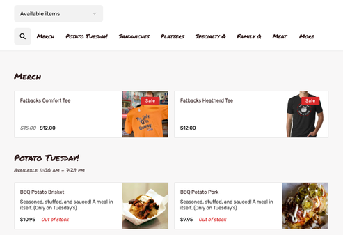
The last point I will highlight is the organization of the categories. They’re laid out in what (to me, at least), is an order that makes sense. The first two categories are merch and time-sensitive specials.
It’s potatoes for me as I write this… I love potatoes… Sorry, I was distracted. 😬
After the potatoes… er, specials, you see meals in increasing sizes, and finally sides and extras. This is a pattern you’ll see repeated in printed menus, too, so it’s an intuitive sequence for a person to order from.
What do you think? Let me know in the comments below! Let me know if you have a site you want to nominate - just send me a private message (hover over my username, then click on the button in the popup to send a message)!
Seller Community, Platform
- Labels:
-
Featured Site
-
Square Online
- Mark as New
- Bookmark
- Subscribe
- Subscribe to RSS Feed
- Permalink
- Report
- Subscribe to RSS Feed
- Mark Thread as New
- Mark Thread as Read
- Float this Thread for Current User
- Bookmark
- Subscribe
- Printer Friendly Page
Thanks for the info. I do bbq too, here is my current site.
https://sotexbbqco.square.site/
Any feedback is appreciated!
- Subscribe to RSS Feed
- Mark Thread as New
- Mark Thread as Read
- Float this Thread for Current User
- Bookmark
- Subscribe
- Printer Friendly Page
I'll DM you some ideas!
- Subscribe to RSS Feed
- Mark Thread as New
- Mark Thread as Read
- Float this Thread for Current User
- Bookmark
- Subscribe
- Printer Friendly Page
Thanks for this font change info! I finally got to update my site fonts to match all the business branding I had done before I made my site!
- Subscribe to RSS Feed
- Mark Thread as New
- Mark Thread as Read
- Float this Thread for Current User
- Bookmark
- Subscribe
- Printer Friendly Page
More Text options would be nice for the website. It is very limited.
I have also inquired about the ability to hide Categories on the website instead of having to delete and then recreate them later, i.e. Holiday Specials. That's a lot of time and work lost.
- Subscribe to RSS Feed
- Mark Thread as New
- Mark Thread as Read
- Float this Thread for Current User
- Bookmark
- Subscribe
- Printer Friendly Page
I see what you mean, @ViolantesMeat, and it would make sense to have that control at the category level since we do at the item level.
Seller Community, Platform
- Mark as New
- Bookmark
- Subscribe
- Subscribe to RSS Feed
- Permalink
- Report
- Subscribe to RSS Feed
- Mark Thread as New
- Mark Thread as Read
- Float this Thread for Current User
- Bookmark
- Subscribe
- Printer Friendly Page
No need to delete them @ViolantesMeat !
Just mark ALL of the items inside of it as "unavailable" and the category will disappear! If you still have items as "Visible" it will show whatever items you have underneath that category, and none of the other items that are marked as "Unavailable".
Make sense? Let me know if you need any help!
- Subscribe to RSS Feed
- Mark Thread as New
- Mark Thread as Read
- Float this Thread for Current User
- Bookmark
- Subscribe
- Printer Friendly Page
how did he get the bakground to reach over the header?
- Subscribe to RSS Feed
- Mark Thread as New
- Mark Thread as Read
- Float this Thread for Current User
- Bookmark
- Subscribe
- Printer Friendly Page
Correct me if I'm wrong, but you simply made your navigation section background transparent so the other section background shows, right, @Devin3627?
Seller Community, Platform
- Subscribe to RSS Feed
- Mark Thread as New
- Mark Thread as Read
- Float this Thread for Current User
- Bookmark
- Subscribe
- Printer Friendly Page
Right @AdamB! It's just the normal site header with the transparent location info.
- Subscribe to RSS Feed
- Mark Thread as New
- Mark Thread as Read
- Float this Thread for Current User
- Bookmark
- Subscribe
- Printer Friendly Page
Great site, probably one of the best I’ve seen. One question I have is regarding the header still, how did you go about adding the text above the logo where you wrote about being open and delivery? My other question is regarding your footer, how did you get all the nice looking text / personal map down there? Are you just adding text boxes?
thanks so much!
- Subscribe to RSS Feed
- Mark Thread as New
- Mark Thread as Read
- Float this Thread for Current User
- Bookmark
- Subscribe
- Printer Friendly Page
I don't see the text when I check @Devin3627's site, but I'm assuming it's a popup banner. You should see an option for that in Communications > Pop-ups in Square Online.
Seller Community, Platform
- Mark as New
- Bookmark
- Subscribe
- Subscribe to RSS Feed
- Permalink
- Report
- Subscribe to RSS Feed
- Mark Thread as New
- Mark Thread as Read
- Float this Thread for Current User
- Bookmark
- Subscribe
- Printer Friendly Page
Speaking of popup banners, @AdamB - mine seems to not be working since an update a few months ago. Not sure if it was a square online update or just jumping up to ios15 - but something seemed to wonk them for me. I get a red chunk of background up top on mobile that you can pull down to refresh, but no Banner anymore.
- Subscribe to RSS Feed
- Mark Thread as New
- Mark Thread as Read
- Float this Thread for Current User
- Bookmark
- Subscribe
- Printer Friendly Page
Did you remove the banner already? I don't see one in iOS at all (except for a bit of red at the very top of my phone), and I see nothing at all in Safari or Chrome in mac OS.
Seller Community, Platform
- Subscribe to RSS Feed
- Mark Thread as New
- Mark Thread as Read
- Float this Thread for Current User
- Bookmark
- Subscribe
- Printer Friendly Page
Nope - still active, that's the weird part.
- Subscribe to RSS Feed
- Mark Thread as New
- Mark Thread as Read
- Float this Thread for Current User
- Bookmark
- Subscribe
- Printer Friendly Page
I'm not sure if this is the cause, but the embed code you have in the middle of the page to get updates is missing the closing </center> tag. I'm surprised that wasn't caught by the section since it tries to make sure your code isn't missing tags. Let me know if adding that and publishing again doesn't resolve it for you.
Seller Community, Platform
- Subscribe to RSS Feed
- Mark Thread as New
- Mark Thread as Read
- Float this Thread for Current User
- Bookmark
- Subscribe
- Printer Friendly Page
Thanks for taking a deep dive into this, @AdamB !
Good catch!
Hmm, interesting.
I just fixed it but it shouldn't be the cause -- that code's been like that for a year and the banner only stopped working a couple of months ago.
- Subscribe to RSS Feed
- Mark Thread as New
- Mark Thread as Read
- Float this Thread for Current User
- Bookmark
- Subscribe
- Printer Friendly Page
Whooops, nevermind, I caught it -- it was an old Date-based limit that I didn't realize was activated.
Sorry for the goose chase!
- Subscribe to RSS Feed
- Mark Thread as New
- Mark Thread as Read
- Float this Thread for Current User
- Bookmark
- Subscribe
- Printer Friendly Page
Aha! Mystery solved - guess we both had an exciting day fishing.
Seller Community, Platform
- Subscribe to RSS Feed
- Mark Thread as New
- Mark Thread as Read
- Float this Thread for Current User
- Bookmark
- Subscribe
- Printer Friendly Page
Haha, Always a good time.
Thanks again for the help and sorry again that it was something I missed!
- Subscribe to RSS Feed
- Mark Thread as New
- Mark Thread as Read
- Float this Thread for Current User
- Bookmark
- Subscribe
- Printer Friendly Page
@Archie1 Let me know if you need any help!
- « Previous
-
- 1
- 2
- Next »


