- Subscribe to RSS Feed
- Mark Thread as New
- Mark Thread as Read
- Float this Thread for Current User
- Bookmark
- Subscribe
- Printer Friendly Page
Hello! Every other week, I will be featuring rad sites built using Square Online by sellers like you. It’s a great way to pick up tips that you can incorporate into your own site!
This week we’re going to take a look at the website for Etude Coffee by @etude_coffee.
First, let’s take a look at the domain name itself. Etude is using what is sometimes called a “notcom” domain name, which is essentially any domain that doesn’t use .com as the domain name extension. In the last couple decades, the number of domain name extensions has grown considerably: as of March 2021 there were at least 1589!
Going with something other than .com can provide two big benefits:
- You might be able to get something that wasn’t available as a .com but is available with another extension.
- The extension itself can help tell visitors what the site is about before they even see it.
For the entire list of extensions, see the list of internet top-level domains.
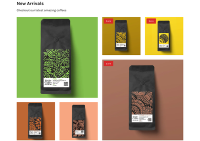
Next, let’s look at the homepage of the site and more specifically, the newest arrivals section. Etude is using the featured items section and what is called a “masonry layout”.
It has this name because the images are stacked like masonry bricks. It’s visually dynamic and can add some visual interest while still remaining orderly.
Lastly, notice the use of bold colors with the product images. They are both visually exciting but also very on-brand, matching the colors used on their packaging. When considering colors for your own online store, look to your own branding and designs. Are there specific colors that you use? Those should be used within your online store if they are suitable for websites and accessibility.
What do you think? Let me know in the comments below! Let me know if you have a site you want to nominate - just send me a private message (hover over my username, then click on the button in the popup to send a message)!
For more in this series, see the list of featured site posts.
Seller Community, Platform
- Labels:
-
Featured Site
Very cool site. I like the Equipment/Training images and how they are portrait. It really breaks up the page nicely.
I also like how they used a notification banner on the top to let us know there is "Free delivery for orders over £30!" It makes you want to fill up that cart!
I think what is also effective is that there are multiple ways to get to Shop Coffee, Training, and more. You may not notice or click the first one, but by the second or third one you're hooked. Makes getting to what you want much more accessible.
Seller Community, Platform
- Mark as New
- Bookmark
- Subscribe
- Subscribe to RSS Feed
- Permalink
- Report
Hi Adam,
Thanks a lot for featuring our website. We love our website and branding, Square made it super simple to build it and we've been loving using Square and have had so much fun with it.
If you have any suggestions, let us know.
Many thanks
Amir
Director of Etude Coffee
I am still fairly new to building our website. The process has been pretty easy but I am still learning for sure, could you tell me how to add the notification banner to the top of the website like the one in your featured site please? I have looked everywhere so any info you could provide would be great.
Thanks!
- Mark as New
- Bookmark
- Subscribe
- Subscribe to RSS Feed
- Permalink
- Report
Hey there @littleowl this is called an announcement banner and can be accomplished by visiting the Communications > Pop-ups section. You can learn more here.
Community Moderator, Square
Sign in and click Mark as Best Answer if my reply answers your question.
Thank you.


