- Subscribe to RSS Feed
- Mark Thread as New
- Mark Thread as Read
- Float this Thread for Current User
- Bookmark
- Subscribe
- Printer Friendly Page
Featured Square Online Site: Miette Patisserie & Confiserie
Hello! Every other week, I will be featuring rad sites built using Square Online by sellers like you. It’s a great way to pick up tips that you can incorporate into your own site!
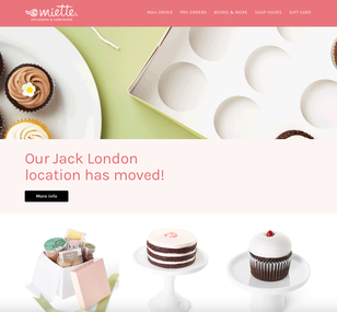
This week we’re taking a look at miette.com, the website for Miette Patisserie & Confiserie. The first thing you’ll notice when landing on their homepage is the animated GIF they use in the background of their header section.


This image cleverly shows a confection box opening and desserts moving over to the plate next to it. It’s engaging, but because the animation only plays once it doesn’t become distracting or overwhelming. Neat!
The next thing I want to highlight is how consistent branding is on the site. This is something I’ve mentioned about other featured sites, but it bears repeating.
Consistent branding is probably the #1 thing you can do to give your website a professional look. It practically screams to customers that you’re organized, professional, and you really have your business together.
The third point I want to focus on is something I mentioned before with Fatback’s BBQ: product photos. Miette’s photos not only show off their products in a consistent and clear way, they also include packaging which further ties in their branding!
The intense craving for toffee I feel right now is directly a result of their impressive product photography. Square actually provides a really affordable and awesome service you can utilize for this, too: Square Photo Studio.
What do you think? Let me know in the comments below! Let me know if you have a site you want to nominate - just send me a private message (hover over my username, then click on the button in the popup to send a message)!
For more in this series, see:
Featured Square Online Site: Bentspoke Brewing, Co
Featured Square Online Site: Sheek Studio
Featured Square Online Site: Whisky Run Golf Club
Featured Square Online Site: Fatback’s BBQ
Seller Community, Platform
- Labels:
-
Featured Site
-
Square Online
- Subscribe to RSS Feed
- Mark Thread as New
- Mark Thread as Read
- Float this Thread for Current User
- Bookmark
- Subscribe
- Printer Friendly Page
I love the Mail Order, Pre-Orders, Pick Up + Delivery options on the bottom of the front page. It lets the customer know that any way you want it, you can get it!
The photos of the cookies and cupcakes are extremely well done. I would love to know how they took the photos (professional photographer? iPhone? photo editing afterwards?).
Integrating the Instagram photos on the Square Online page is great. I may have to try it.
- Subscribe to RSS Feed
- Mark Thread as New
- Mark Thread as Read
- Float this Thread for Current User
- Bookmark
- Subscribe
- Printer Friendly Page
With good lightning, a newer iPhone can take really nice product photos. If you use the same general setup for consistency, you can definitely use a phone for something like that.
Seller Community, Platform
- Mark as New
- Bookmark
- Subscribe
- Subscribe to RSS Feed
- Permalink
- Report
- Subscribe to RSS Feed
- Mark Thread as New
- Mark Thread as Read
- Float this Thread for Current User
- Bookmark
- Subscribe
- Printer Friendly Page
this site has am awesome header. nice and large with graphic and logo. When I try to mimic this my header is tiny at an inch in height. What do I need to do to get this?
- Mark as New
- Bookmark
- Subscribe
- Subscribe to RSS Feed
- Permalink
- Report
- Subscribe to RSS Feed
- Mark Thread as New
- Mark Thread as Read
- Float this Thread for Current User
- Bookmark
- Subscribe
- Printer Friendly Page
replying to my own message to say that I figured it out! use a photo in the main header and make it xl and make the header transparent. I had no clue the header could be transparent. that is the trick! just in case anyone else needed to know.


