In the coming weeks, we're launching a number of updates to the Customers section in your Square Point of Sale application on iOS and Android. These changes will make it easier and faster for you to find the customer information you need, and will help you provide a high-quality, personalized experience for your customers.
Here are the key updates:
1. Easier navigation to speed up your customer-related tasks
2. Better search to find the right customer faster
3. Improved profile format and clearer organization to find details more quickly
1. Easier navigation to speed up your customer-related tasks
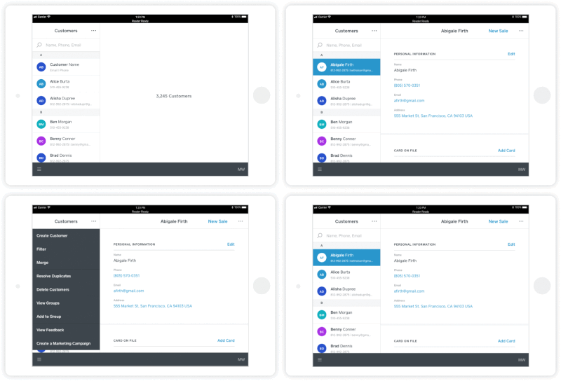
We know your customers are at the center of your business, so we wanted to put your customers front and center in your Customers section. We're calling it “customer-focused navigation”. To start, we've changed what information you see when you land on the Customers section. Instead of showing groups on the side and a customer list taking up the main part of the screen, we now show a full list of customers on the left, and detailed customer information is the primary focus.
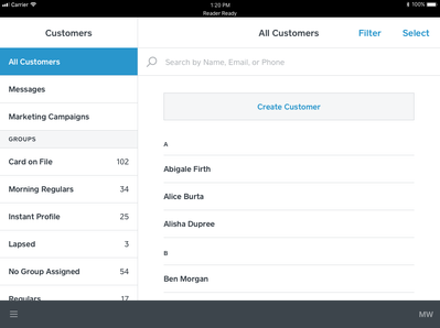
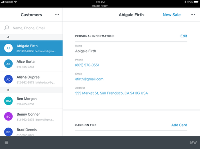
Within the customer list, we're now including email and phone numbers, so you can immediately see the contact information without needing to view a customer's profile!
We've also added a new drop-down menu on the main Customers screen, so you can create a new profile, filter customers, manage groups, add customers to groups, resolve duplicates, merge customers, bulk delete, and view feedback from virtually any screen.
2. Better search to find the right customer faster
When you're trying to pull up a customer's profile (especially if the customer is in front of you!), the last thing you want to do is spend time searching for them, right? With this in mind, we've made changes to search in the Customers tab to help you find the right customer more quickly.
When you select a customer you think you're looking for, you can immediately see the details of the profile, allowing you to quickly determine whether that is in fact the right customer.
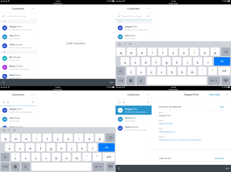
We've also made it more clear when you've applied a filter or are searching within a group - these filters show up right below the search box, and you can easily remove them by tapping on the "x" next to a specific filter.
3. Improved profile format and clearer organization to find details more quickly
We heard feedback that it was hard to quickly find details within a customer profile, so we've redesigned them to have better organized information, and make it easier to quickly scan to find what you are looking for.
At the top you'll find the essential personal info - the name, phone number, email and address. And editing this information is now easier, as we've improved the labeling of each field and the overall layout.
Within each customer profile, we revamped how we organize information and created cards, or sections, that contain related information. We hope by organizing information into distinct cards, you'll be able to find what you're looking for faster.
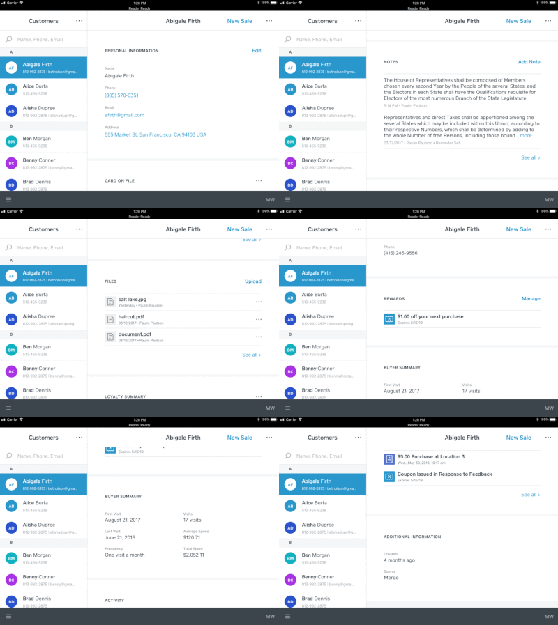
We also combined all of the actions you might take while viewing a customer profile into a single drop-down menu. Now, you can edit the customer profile, add a note, upload a file, send invoices or messages, and delete a customer, all from the same place. This should help streamline your workflows, allowing you to focus your attention on serving your customers.
---
We hope you’ll find these updates helpful! Leave a comment and tell us what you think, and let us know how else we can make Customer Directory a more useful tool to help you better serve your customers and run your business more seamlessly.
