Hey everyone, we’ve got more Square Online updates to share with you. Check ‘em out below!
Shopping experience improvements
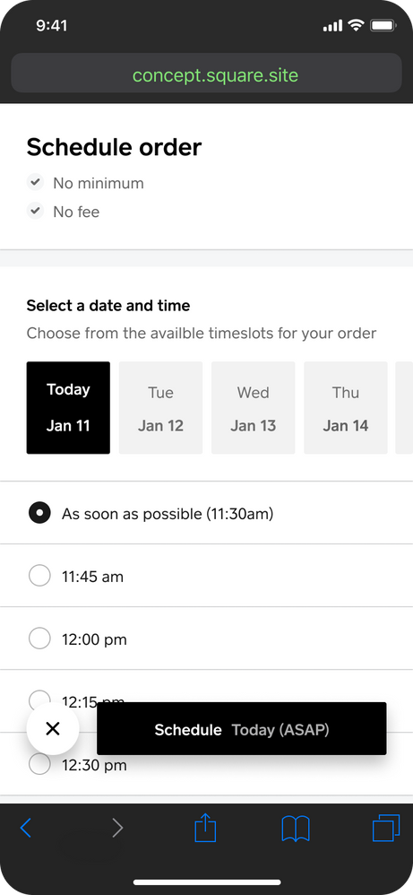
Order scheduling screens have been updated to give the feel of a native app on mobile. Intuitive controls and a clean, sleek design contribute to a superior shopping experience.
Also, when customers view an item, they can now see its availability and fulfillment options across all your locations. This will help them make better buying decisions while shopping your site.
Head to your Item Library to edit your item availability and fulfillment channels.
Site editor updates
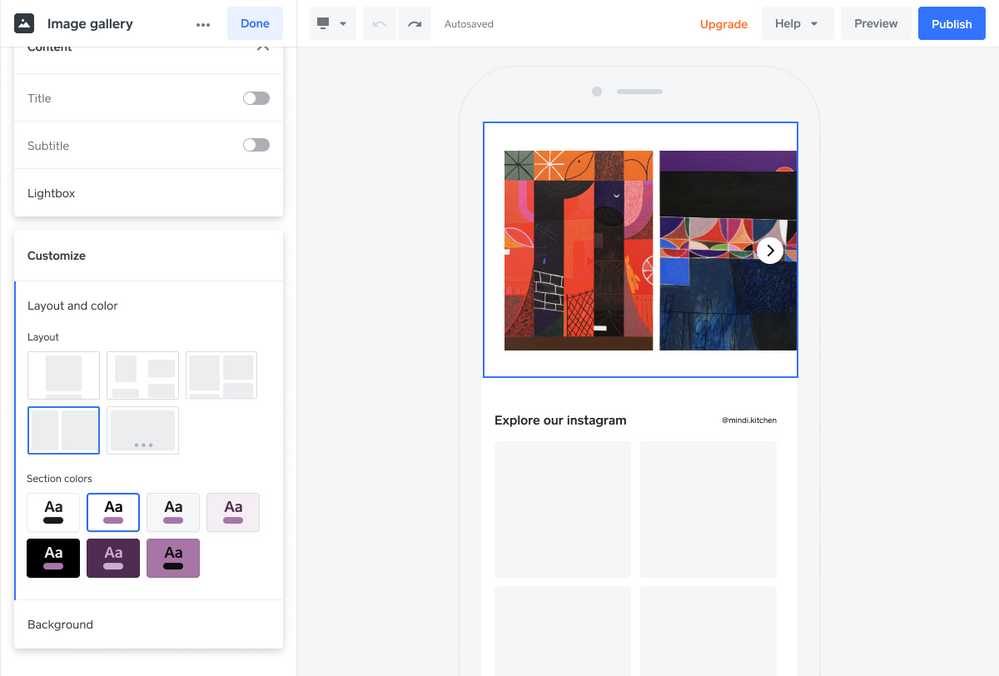
New image gallery layouts have been added to the site editor, allowing more flexibility to accommodate images with multiple aspect ratios. A multi-column masonry-style gallery looks great on desktop and rearranges smartly for mobile.
Also, more text + image section layouts have been added to the website editor. Partial overlays of text on images and other cool layouts can help your site stand out.
Edit your site and explore the new gallery and text + image options.
Updated dashboard navigation
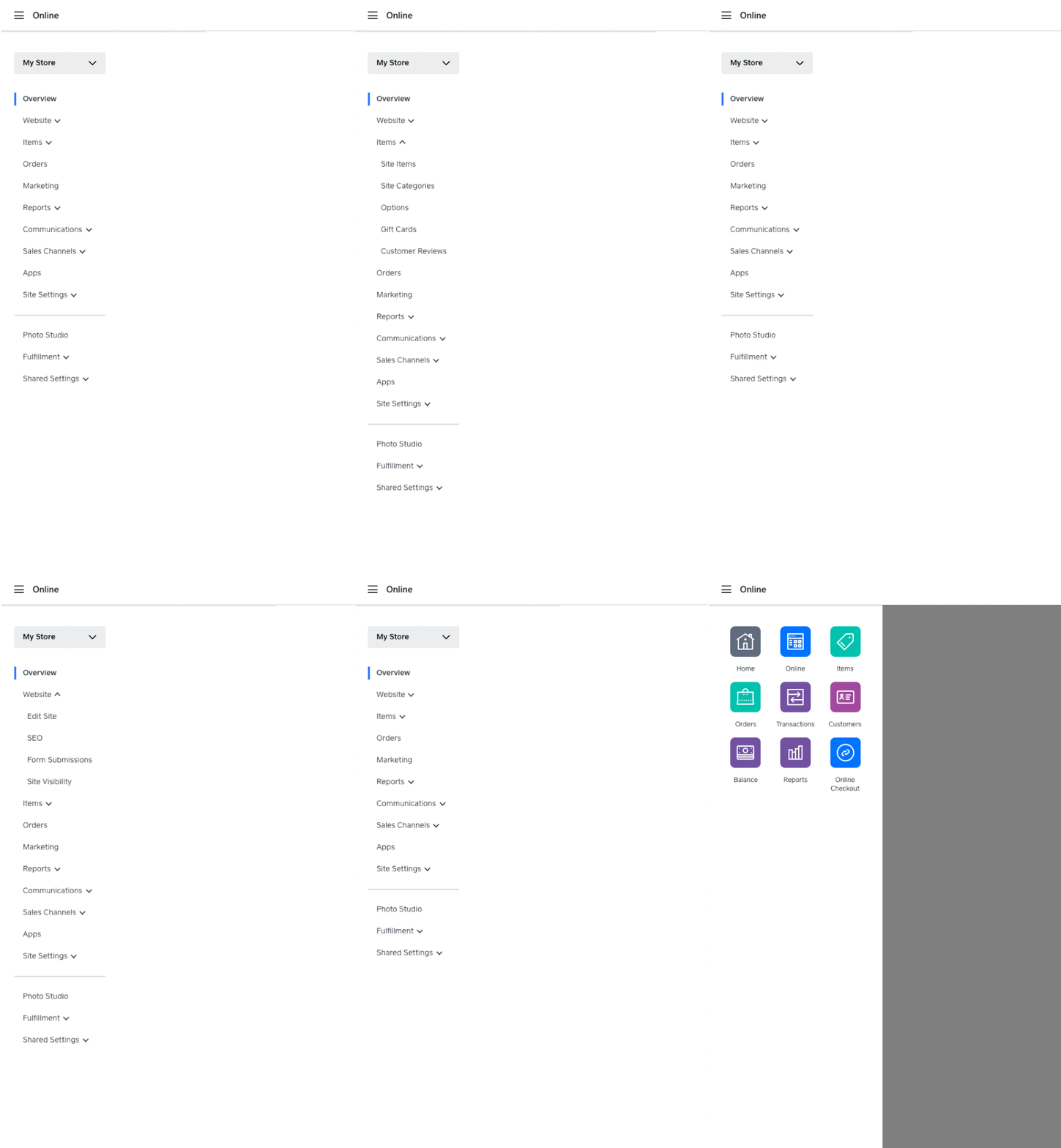
The left-hand navigation menu on your Online dashboard has been re-organized into a more logical, useful layout. There are more collapsible sections, arranged so you can quickly find what you need.
And now when you select Online in the upper left corner, you’ll see icons for Square account tools that you previously would have had to go back to your home Square dashboard to access. View all your Square orders, customers, reports, and more, without leaving the Online dashboard.
We hope you enjoy these updates, and we’re excited to bring you more soon!


