- Subscribe to RSS Feed
- Mark Thread as New
- Mark Thread as Read
- Float this Thread for Current User
- Bookmark
- Subscribe
- Printer Friendly Page
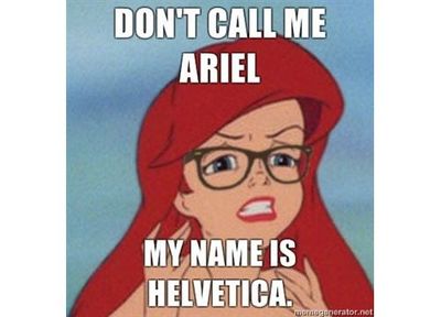
Hello again! 👋 This meme has nothing to do with this post, but it appeals to my sense of humor and is somewhat related because… fonts!
A few weeks ago, I asked sellers like you to share your Square Online site and get expert feedback. It was a lot of fun - thank you to everyone who commented looking for advice.
If you missed it the first time around, now is your chance to get expert advice for your own store. Comment below and share the website address of your store, and I’ll provide advice and tips you can use to up your game! 😁
Seller Community, Platform
- Labels:
-
Square Online
Hi Adam, It's Nancy,(My son's name is Adam also, Nancy) My website is www.customdecorden.com I've changed a few things, colors, backgrounds, Logo. Let me know what you think and what to improve on please and thank you.
- Mark as New
- Bookmark
- Subscribe
- Subscribe to RSS Feed
- Permalink
- Report
Please give my site a run through, http://paradiseicemore.com Any suggestions would really be helpful. Thanks Tony
- Mark as New
- Bookmark
- Subscribe
- Subscribe to RSS Feed
- Permalink
- Report
Selecting the right font style is a must! ahhhhhhh.
- « Previous
- Next »

