- Subscribe to RSS Feed
- Mark Thread as New
- Mark Thread as Read
- Float this Thread for Current User
- Bookmark
- Subscribe
- Printer Friendly Page
Featured Square Online Site: Revival Vintage Bottle Shop
Hello! Every other week, I will be featuring rad sites built using Square Online by sellers like you. It’s a great way to pick up tips that you can incorporate into your own site!
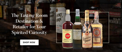
This week we’re going to take a look at the website and online store for Revival, a vintage bottle shop in Kentucky. This week, I’m focusing on making a strong first impression with the header of your site.
The first item I want to call attention to is the combination of a background image and the image of the bottles on the right. Even though the image on the right has a border, it’s still transparent. This allows more of the background to show so it feels less like a blocky image slapped on the page. Together, they present a professional look that wouldn’t be out of place in a glossy magazine spread.
Next, let’s take a closer look at the site navigation menu. The human brain can typically analyze and hold between 5 - 9 items in memory at a given time. In total, there are 7 items if you count text links and the search and cart icons - right in the middle of the range, and just enough to highlight important information without being overwhelming. As a visual bonus, the six text links also fit evenly between the icons and the site logo.
Finally, notice the banner at the top of the site. It’s being used purely to communicate information rather than to promote or entice sales; banners are really useful whenever you want to get something front-and-center for visitors. This banner is a great example of how to be highly visible yet unobtrusive.
What do you think? Let me know in the comments below! Let me know if you have a site you want to nominate - just send me a private message (hover over my username, then click on the button in the popup to send a message)!
For more in this series, see:
Featured Square Online Site: Tend Greenpoint
Featured Square Online Site: Salsa Saint
Featured Square Online Site: The Benev
Featured Square Online Site: Bradley’s Orchard
Featured Square Online Site: Miette Patisserie & Confiserie
Featured Square Online Site: Bentspoke Brewing, Co
Featured Square Online Site: Sheek Studio
Featured Square Online Site: Whisky Run Golf Club
Featured Square Online Site: Fatback’s BBQ
Seller Community, Platform
- Labels:
-
Featured Site
-
Square Online
- Subscribe to RSS Feed
- Mark Thread as New
- Mark Thread as Read
- Float this Thread for Current User
- Bookmark
- Subscribe
- Printer Friendly Page
I'm so confused! I've been trying to make my header like this site's. I want my header larger like this with a big photo. When I go in to add or make changes my header is like an inch in height. What am I doing wrong?
- Mark as New
- Bookmark
- Subscribe
- Subscribe to RSS Feed
- Permalink
- Report
- Subscribe to RSS Feed
- Mark Thread as New
- Mark Thread as Read
- Float this Thread for Current User
- Bookmark
- Subscribe
- Printer Friendly Page
replying to say I figured it out. make the header transparent and xl photo in main header. I didn't know header could be transparent. just in case anyone else needed to know,
- Subscribe to RSS Feed
- Mark Thread as New
- Mark Thread as Read
- Float this Thread for Current User
- Bookmark
- Subscribe
- Printer Friendly Page
Glad to hear that you figured it out, @dustytreesoap!
Seller Community, Platform
- Subscribe to RSS Feed
- Mark Thread as New
- Mark Thread as Read
- Float this Thread for Current User
- Bookmark
- Subscribe
- Printer Friendly Page
@AdamB I have 11 items in my nav bar. Should I delete a few?
- Subscribe to RSS Feed
- Mark Thread as New
- Mark Thread as Read
- Float this Thread for Current User
- Bookmark
- Subscribe
- Printer Friendly Page
It's something to consider, although there's always exceptions. Which site are you working on?
Seller Community, Platform
- Mark as New
- Bookmark
- Subscribe
- Subscribe to RSS Feed
- Permalink
- Report


