- Subscribe to RSS Feed
- Mark Thread as New
- Mark Thread as Read
- Float this Thread for Current User
- Bookmark
- Subscribe
- Printer Friendly Page
Understanding background images and how they work on different screen sizes
With the Square Online editor you can use images as section backgrounds. They’re a great way to add visual interest to a page while still letting you add additional content on top of them. The increasing use of mobile devices like tablets and smartphones presents a unique challenge with background images, though. How do you make sure that they look good across different screen sizes?
First, let’s talk about what makes a good background image. The best background images fit your brand and style, do not inhibit legibility, and look good no matter how much or little they are cropped. You’ll want something that fits your visual aesthetic but isn’t necessarily the focus of it. For example, what if you have a website where you sell flower seeds? A good image has many flowers in it rather than a single flower. Even if part of the image is cropped, you will still see flowers in the background image. You’ll have the best results if you consider how an image will look cropped when choosing it, rather than being surprised by this later.


Let’s see this in action, though. Here’s an example website where the background image is cropped differently on different screen sizes. I’ve added a background image to the homepage section that deliberately doesn’t follow the advice above. On desktop screens, the focus is less on the guitar player as a whole and more on the guitar and the player’s hands. What happens on mobile devices, though? Well, you can see from these screenshots that it’s the reverse:
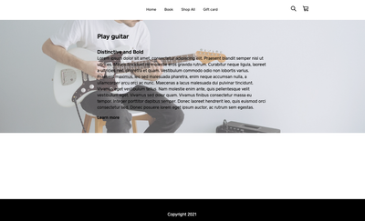
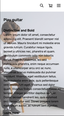
Why does this happen? Well, imagine reducing the width of the desktop window until your text starts to wrap and become taller. Your section now needs to be much taller to accommodate your text. Because of this, you’ll see more of the background image vertically, and the sides of the image will be cropped. If this didn’t happen, the background image would become squished horizontally.
So, what can you do to change how your image looks on any size screen? The easiest solution is to simply choose one where it doesn’t matter how much is cropped or shown. For this solution, I swapped in a different image where there isn’t much focus on any individual part. Regardless of how the image is cropped, it still looks good as a background.
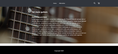
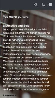
But what if you really want a specific image? The simplest solution is to add more content to your section if possible. This will mean that more of the image is shown on wider screens, so the only significant difference between large and small screens is how much the sides are cropped.
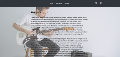
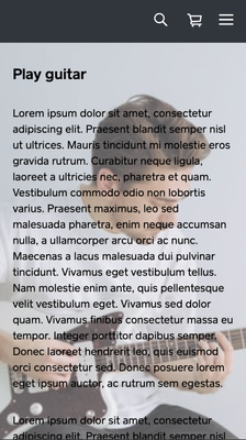
With the Square Online editor, you can set a focal point for the image. This will help control which part is kept within the screen as the edges are cropped. And if you don’t want to add more text? You can also use line breaks instead of text (if you visit the example site I linked, you will see I did this on the page called “Home 2”).
However, if you want the image to be fully viewable on all devices, consider using it separately on the page as an image within a section rather than a background. You could use a color background for the section, then use a separate section above or below that with just your image in it.
Have an alternative solution to this that you used to control your background images? Feel free to comment and share!
Seller Community, Platform
- Labels:
-
Square Online
- Subscribe to RSS Feed
- Mark Thread as New
- Mark Thread as Read
- Float this Thread for Current User
- Bookmark
- Subscribe
- Printer Friendly Page
- Subscribe to RSS Feed
- Mark Thread as New
- Mark Thread as Read
- Float this Thread for Current User
- Bookmark
- Subscribe
- Printer Friendly Page
Question, does anyone know the size of the home page banners? Dimension wise?
- Subscribe to RSS Feed
- Mark Thread as New
- Mark Thread as Read
- Float this Thread for Current User
- Bookmark
- Subscribe
- Printer Friendly Page
Hey @Sadboiapparel! Typical size is around 2000 pixels by 1000 pixels.
- Subscribe to RSS Feed
- Mark Thread as New
- Mark Thread as Read
- Float this Thread for Current User
- Bookmark
- Subscribe
- Printer Friendly Page
Hello everyone!
I'm having a trouble to make a responsive image on the home page (twigsandthyme.com) for those who uses a wide-screen computers/laptops with Windows.
I believe I need some sort of coding (maybe not).
Any advice, tip would be highly appreciate!
- Subscribe to RSS Feed
- Mark Thread as New
- Mark Thread as Read
- Float this Thread for Current User
- Bookmark
- Subscribe
- Printer Friendly Page
Welcome to the Community, @NancyOliver 😊
I moved your post over to this thread that Adam created about background images. I think your site looks great at the moment. Did you change the image in question, or is it on a different page of your website?
- Subscribe to RSS Feed
- Mark Thread as New
- Mark Thread as Read
- Float this Thread for Current User
- Bookmark
- Subscribe
- Printer Friendly Page
Thank you, Bernadette! I have not seen this piece. Will look into it=)
- Subscribe to RSS Feed
- Mark Thread as New
- Mark Thread as Read
- Float this Thread for Current User
- Bookmark
- Subscribe
- Printer Friendly Page
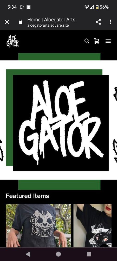
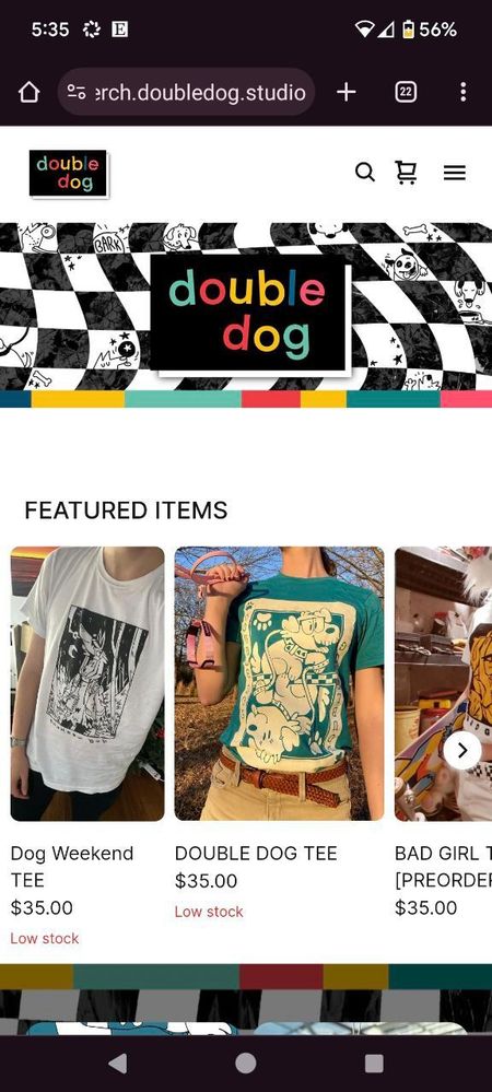
I need my banner to look the same in mobile version as it does in desktop
right now the mobile version is zoomed in and looks terrible
This is how it looks now https://aloegatorarts.square.site/
this one is how I want it to look: https://merch.doubledog.studio/
- Mark as New
- Bookmark
- Subscribe
- Subscribe to RSS Feed
- Permalink
- Report
- Subscribe to RSS Feed
- Mark Thread as New
- Mark Thread as Read
- Float this Thread for Current User
- Bookmark
- Subscribe
- Printer Friendly Page
Hi there, @hirurux
I moved your post over to this thread where Adam discusses the way the background images work on desktop and mobile devices. He goes into detail on how the images are resized, and also gives suggestions for the best sizes to use.
Hopefully this information helps clarify, and helps you out! Please let us know if you have additional questions.
- Mark as New
- Bookmark
- Subscribe
- Subscribe to RSS Feed
- Permalink
- Report

