- Subscribe to RSS Feed
- Mark Thread as New
- Mark Thread as Read
- Float this Thread for Current User
- Bookmark
- Subscribe
- Printer Friendly Page
Hi sellers,
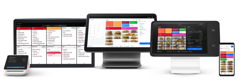
As we mentioned in January, we redesigned the Square Restaurants POS to make it easier to navigate and stay productive throughout service. This redesign includes highly requested features and a new look and feel that will appear on all of your devices starting 5 March 2024.
This update helps you:
- Speed up order entry by adding images to menu items and group tiles.
- Personalise hospitality by adding customer profiles to orders.
- Keep service moving by accessing common actions from Bills, Floor Plans or Cart.
- Get to the features and reports you use the most quickly and easily with customised navigation.
If you tried these changes out via Release Manager, we hope you’re enjoying them! If you haven’t turned these updates on yet, they’ll start appearing across your devices starting 5 March.
ℹ️ Note: this upgrade requires POS v6.36 or newer
Learn more about the Restaurants POS Redesign →
- Labels:
-
Square Restaurant POS
- Mark as New
- Bookmark
- Subscribe
- Subscribe to RSS Feed
- Permalink
- Report
Hi Hadley, We have just received the update in our venue and I am not impressed to be honest. The changes has created more steps to complete a process.
Why do we need to see the titles of floor plans across the top? We keep historic floor plans (ie Valentines Days etc( that were fine to have access via swiping right.
Pictures on the item name: This makes it difficult to read the item. Teams don't need pictures as they get used to name. Customers might like pictures so these belong on menus (if that is the style of restaurant) so I don't see the value. (we have removed these painstakingly of every item. I do wonder why someone thought this would be a good idea
When you go to order some items now, it gives you all the options that were previously hidden or restricted to supervisors, ie discounts. Now these come up straight away and it takes another step to remove them on each item.
When I called up, some of the support team were not across these changes and did seem a little perturbed by some of the changes.
Please, when making changes, ensure they simplify the operation, not add steps. Ask the end users what will help them.
I still have issues with modifiers. Why when using them, they then stop the ability to group the product to the kitchen or bar, the Kitchen need to see 3 steaks all together, not separated out by other items on. docket. Same issue with prices on modifiers, you can't order 2 gins and 2 tonics (modifier charge extra) So again it takes time and separates the items on the dockets . To the bar, it would make it better, simpler, cheaper if they got a docket asking for 2 gin and tonics, not individually listed.
I perviously worked in corporate retail ( Tesco/Specsavers/EBOS) and was part of working groups to give input/trial/give feedback from the coalface in ensuring changes were operationally fit for purpose. I am happy to offer my services/support to any such group.
- Mark as New
- Bookmark
- Subscribe
- Subscribe to RSS Feed
- Permalink
- Report

